Cultural Vistas Extranet
A Better Way to Recruit Exchange Visitors
In the United States, Cultural Vistas sponsors J-1 Visa Exchange Visitors and guides them and their host companies through the application process using an extranet, nicknamed CARL.
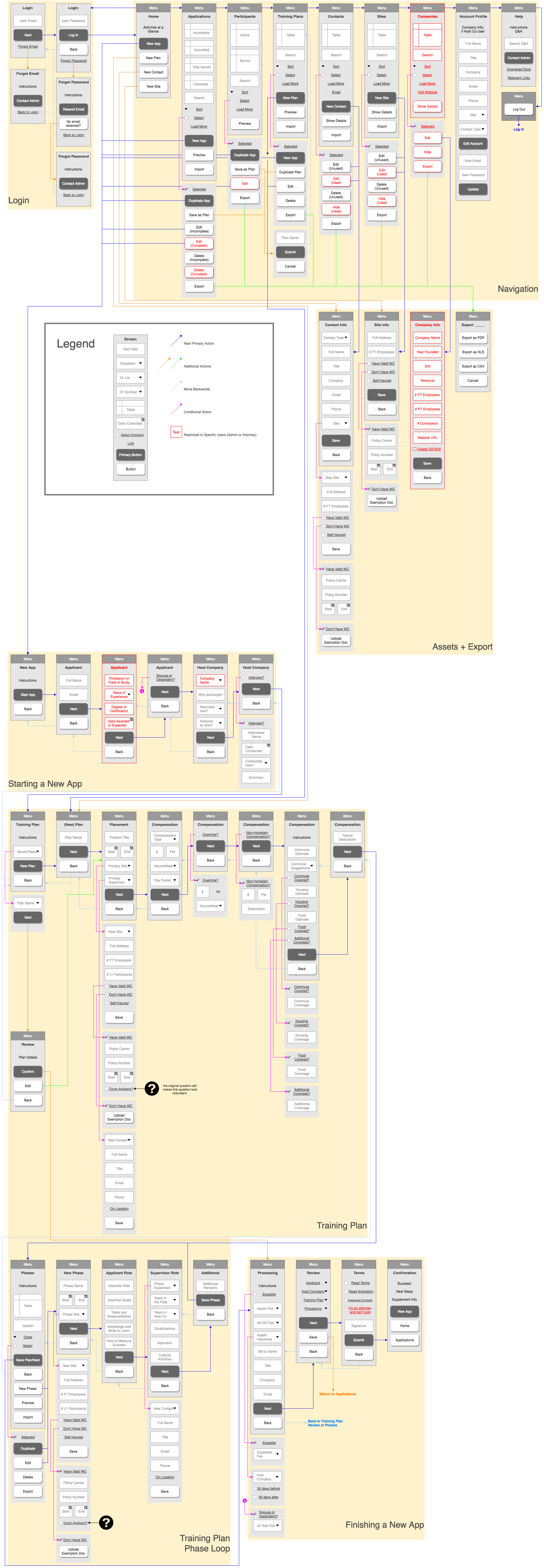
Much of company time and resources were spent troubleshooting CARL’s many user difficulties. Originally tasked with redesigning the interface for CARL’s host company section, I instead developed a new user flow chart with help from the J-1 Visa team and Development team. I presented it to the Executive team as part of a case study to show them that a successful redesign required more than a face-lift.
This case study was a great opportunity to introduce user-centered thinking, reevaluate information architecture, and practice a holistic approach to designing a web application.
Role:
Research, Information Architecture, User Experience
With:
Alison Steffen, Product Management
William Mejia, Application Development
Sarah Hocevar, Subject Matter Expert
User Personas
We identified a lack of applicable data and feedback from CARL users because existing data only focused on customer impressions of their experience abroad. I argued to refocus research efforts for customer acquisition instead of post-program satisfaction.
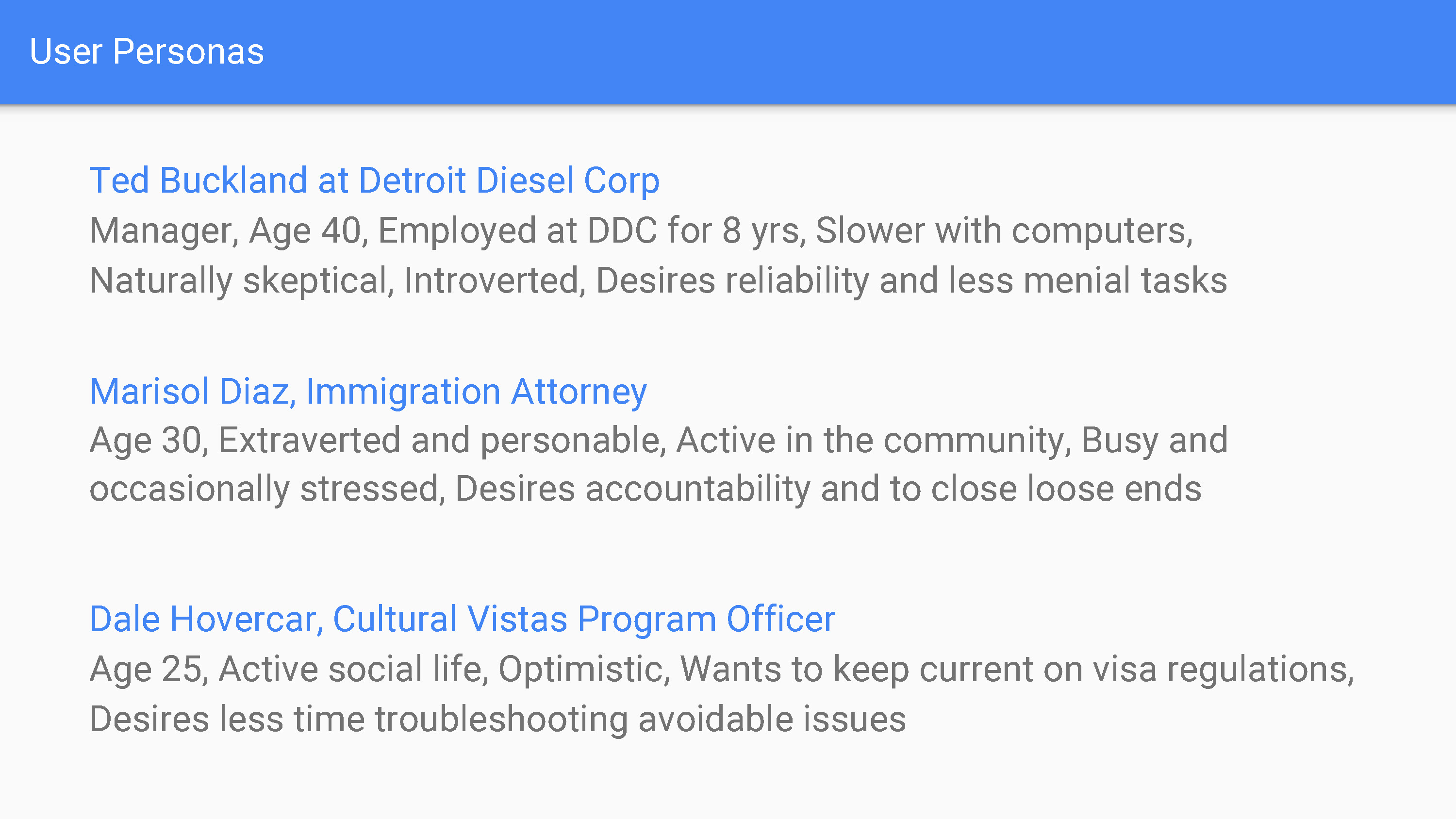
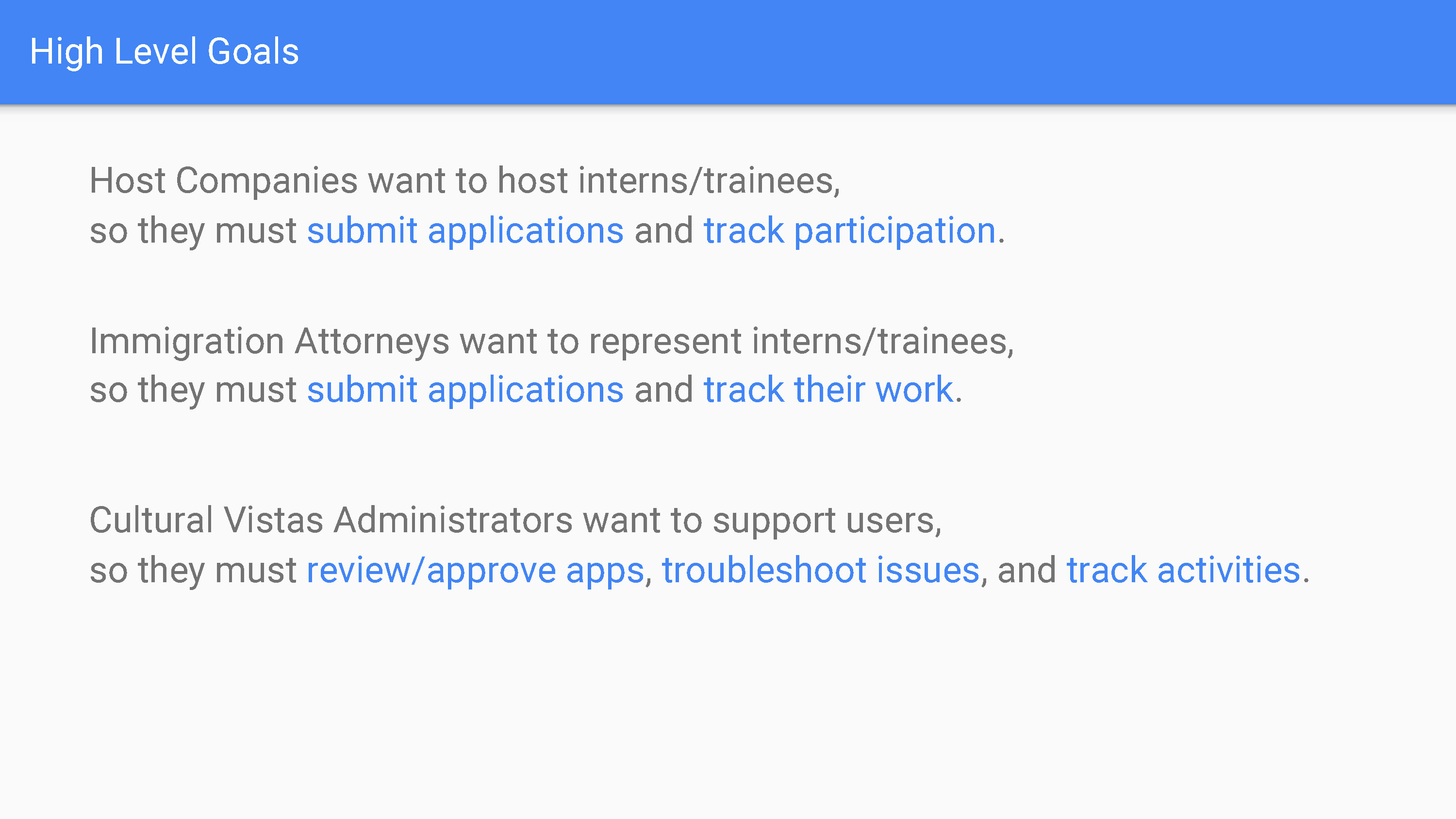
Without hard data on host company users, I created assumption personas and goals with anecdotal evidence from the J-1 Visa team.

Content Structure
We found existing web content to be disorganized and inconsistent, with lots of text over-explaining processes and insufficient labeling to represent information. I pushed for the need for information architecture, to inform content strategy and properly guide users to utilize our service.
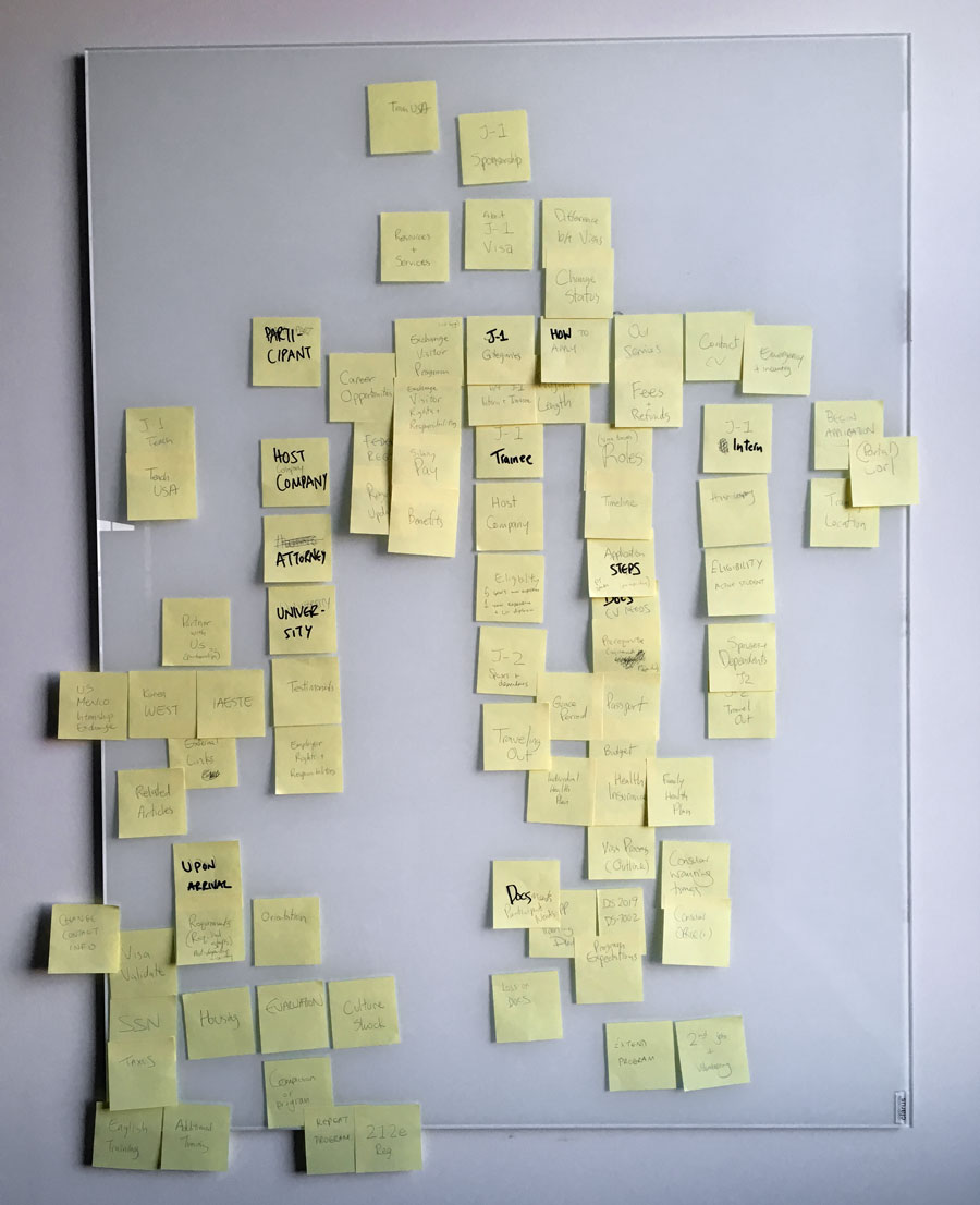
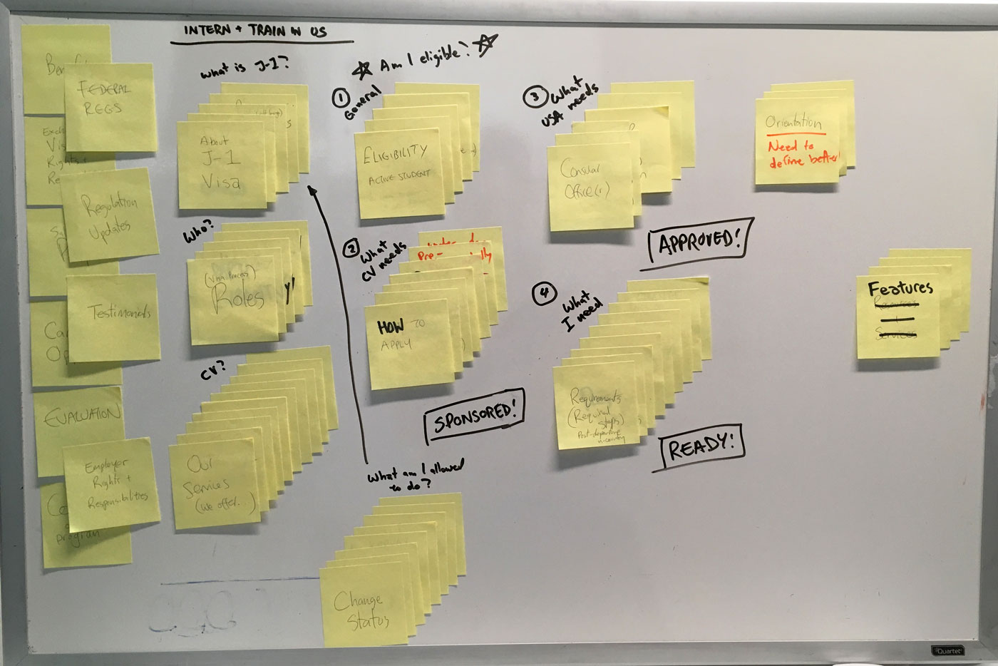
To create a preliminary structure, I conducted card-sorting sessions with the J-1 Visa team to learn the nuances of the application process and to batch information. For CARL, this helped greatly with determining necessary features for a Minimum Viable Product and breaking up the process into logical steps.
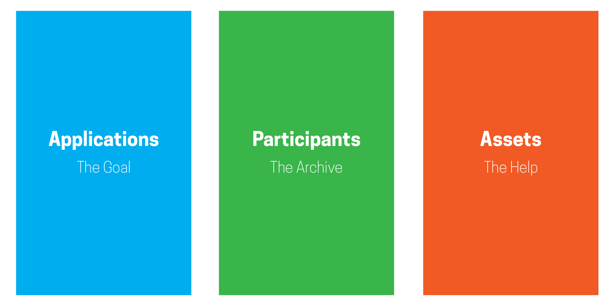

Wireframes
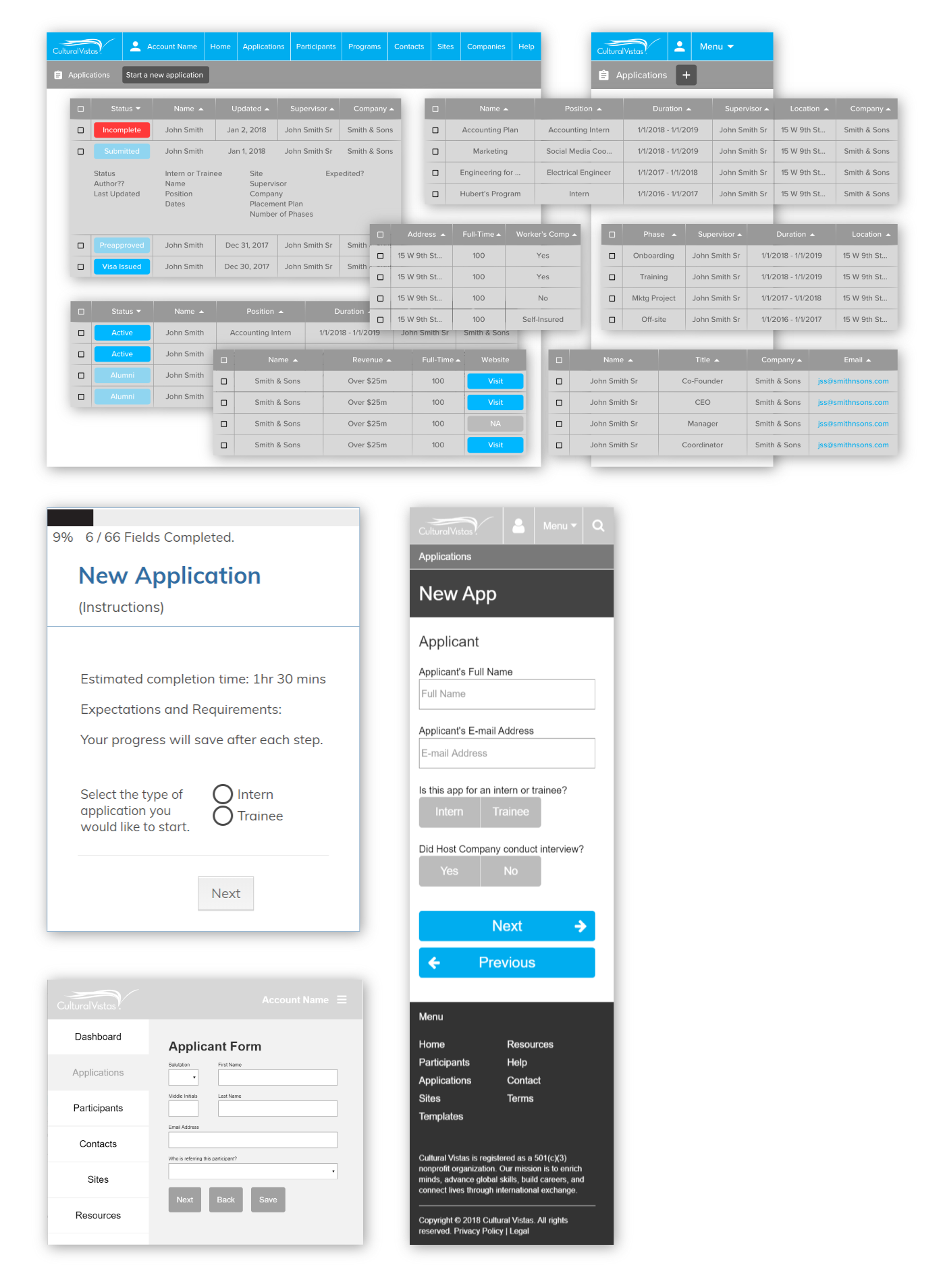
The forms and tables were complex and intrinsically tied to the user flow, so it was important for me to get a better sense of how they functioned. Without information architecture, these were previously designed ineffectively and the interface suffered from lack of direction. I argued that CARL’s interface was just as difficult to use as the paper application form it was supposed to replace.
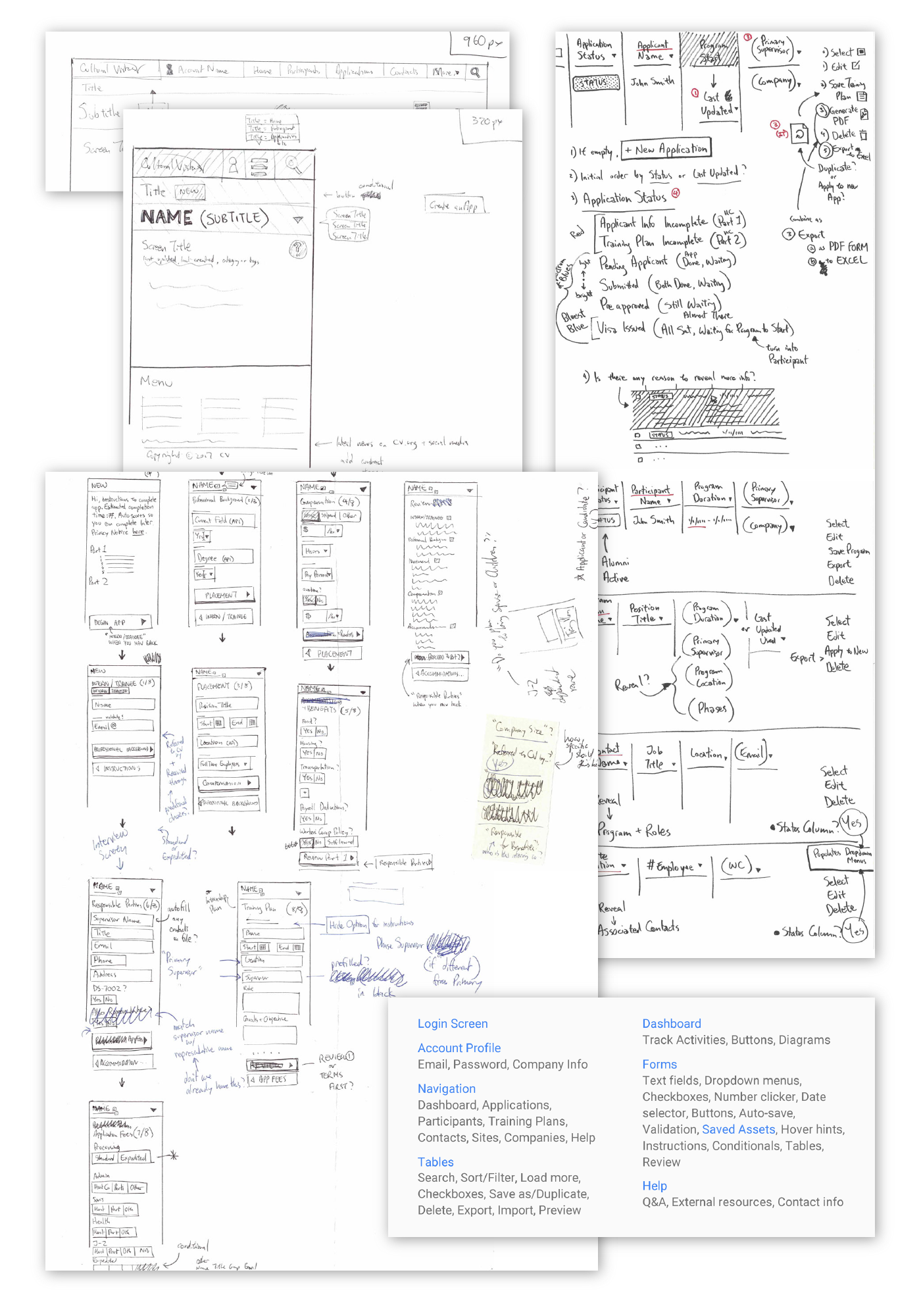
I sketched and prototyped low-fidelity wireframes for both features, not necessarily to design a proper layout but to figure out which content and actions belonged to which screens.
User Flow
I needed to show the Executive team that redesigning CARL was not about fixing layouts, it was about fixing a system. Ultimately, I chose a user flow chart as my final deliverable to introduce the complexity of developing a web application, advocate for organizational collaboration and cohesion, and demonstrate the value of design thinking outside of graphic design.
